

Introduction
Positioning elements precisely where you want them to be on the web page can be very challenging. When elements are not positioned in the appropriate place It can lead to elements overlapping each other, not being able to create complex designs or layouts that require specific positioning, and the design of the web page may appear inconsistent and unprofessional to your users, which can lead to poor user experience. However, a solution exists to the problem and it’s the CSS Position property.
What is CSS Position
The Position property in CSS specifies how an HTML element should be positioned on a web page. CSS provides us with a set of properties for positioning elements on the web page.
Advantages of Using CSS Positions
Precise element positioning: with the CSS position property, you can precisely position an element relative to its parent element container or to the viewport. This allows the creation of complex layouts with a high degree of control over where the element should be on the page.
Layering and stacking: The position property also gives control for the stacking order of elements on the web page. By using the z-index property with position, you can layer elements on top of one another, creating awesome complex visual effects and interactions.
Responsive design: using the position property in combination with media queries and other responsive design techniques, you can create layouts that adapt to different screen sizes, which will ensure that your site looks great on all devices.
In this article we will take a look at the different positioning properties in CSS and how they work. By the end of this article, you are going to be positioning elements on the web page like a CSS God.
Here are the following values that can be used with the position property:
Static Position
The default value for the position property is static. This means that the element will be positioned according to the normal flow of the web document. In other words, the element will appear on the web page in the order in which it is written in the HTML code. For example, these elements stay where they are supposed to be just like written text in a book.

Figure 1.
The above image (figure 1) shows that all the elements in the web page are static. All static elements follow each other in the document flow.
Relative Position
When the position property of an element in the web page is set to relative, the element will be positioned to its normal flow in the document. Relative positioning acts like a Static position but with the super upgrades, Relative positioning gets the opportunity to move its element to the Top, Bottom, Left, and Right side from its original position.

Figure 2.
The above image (figure 2) shows how we wrote our HTML and CSS code, all our toys are inside of the toy box. The moment we added position relative to toy-one element, we were also able to move it a little bit (Top & Right 10px) from where it was supposed to be inside of the toy box.
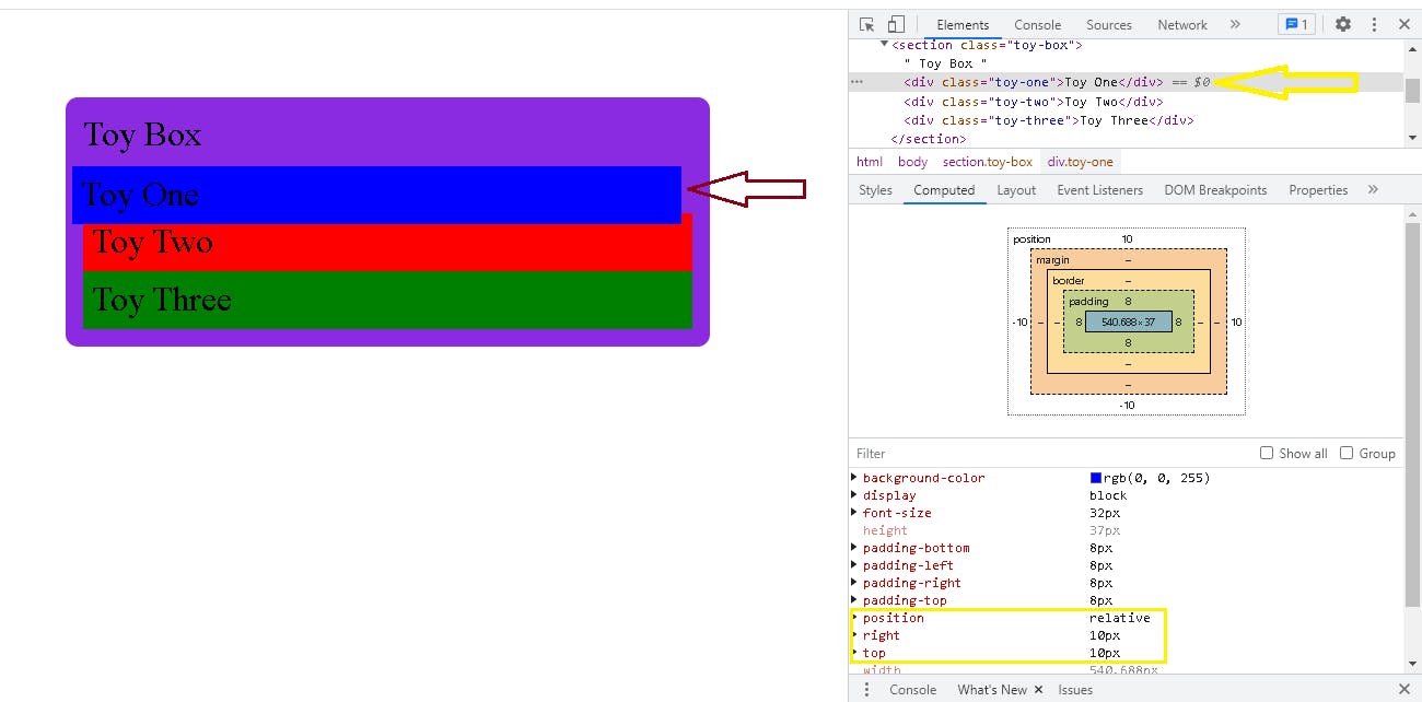
Figure 3.
If you noticed, the other elements (toy-two & toy-three) were not pushed in the same direction as the first element (toy-one) and that is because (toy-one) has been removed from the document flow and no longer works like a static positioned element.
Put in mind that the properties Top, Left, Right, and Bottom are not going to be used on a position relative element because it makes it difficult to style other elements around it. No need to worry the next position value solves that.
Absolute Position
When the position property of an element on the web page is set to absolute, the element will be positioned relative to the nearest positioned parent element.
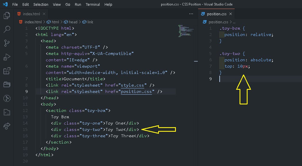
Figure 4.
In the above image (figure 4), toy-two is positioned relative to its parent element which is the toy box. This means that toy-two which is positioned absolute will begin its movement flow from the place where the toy box begins irrespective of how it was written in the HTML, toy-two has moved 10px from the top of the toy box, it skips toy-one, and goes all the way up to its parent element.

figure 5.
If there is no positioned parent element, the element will be positioned relative to the html element itself.

figure 6.
In the above image (figure 6), toy-two is placed in an absolute position without a parent element. so in scenarios like this, the default parent element falls straight to the html element as long as they aren’t any parent element that is positioned relatively.

figure 7.
In the image above (figure 7), toy-two was completely removed from the document flow, it is no longer inside of the toy box container, and it now assumes that its parent element is the html element. It moves 10px from the top of the html element on the web page. Elements that are positioned in Absolute give higher priority to their parent container.
Using absolute positioning simply means that we want something to be in a very specific place, like a sticker on the wall, we can use numbers to tell the sticker exactly where to be. To position the element, we make use of the following CSS properties Top, Bottom, Left, and Right.
Fixed Position
When the position property is set to fixed, the element will be positioned relative to the viewport (screen size). The fixed position element is always fixed based on the entire html page and has nothing to do with its parent element. This means that the element will remain in the same position even if the user scrolls the web page. It is just like absolute but it completely ignores its parent element and heads straight to the top.
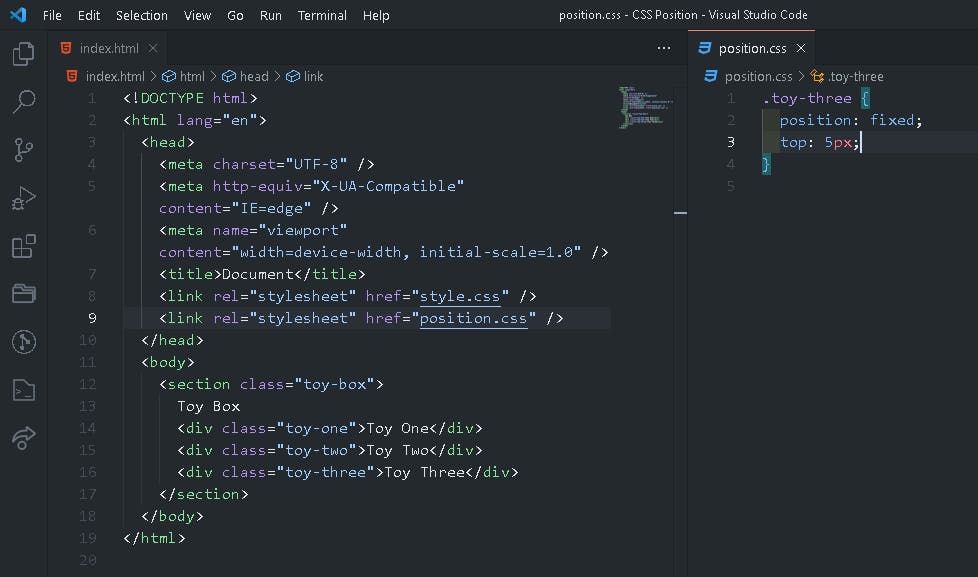
figure 8.

figure 9.
In the above image (figure 9) the moment toy-three was positioned fixed it abandoned its parent element the toy box and move straight to the html element even when we were scrolling the web page toy-three stayed in a single position.
One unique thing you should keep at heart about the position fixed is that they stay in the same place when scrolling the web page, it’s like a picture frame on the wall no matter how we move around the house it stays in a single position. To position the sides of a fixed element, we make use of the following CSS properties Top, Bottom, Left, and Right.
Sticky Position
When the position property is set to sticky the element will act like a combination of both relative and fixed positioning. The element initially assumes its position based on its parent element container but as soon as it reaches a specified threshold it becomes fixed.

figure 10.
In the image above (figure 10) toy-one was assigned the position of sticky. In the document flow of the web page toy-one will first be a relative element and immediately after the element hit the top of the html page the element will then become fixed. See the image below.

figure 11.
The sticky position is used when an element can move around a little bit but then stay in one place once it gets to a certain spot. for example, when you put a magnet on a whiteboard and move it around once you get it to the top, it stays there. To use the sticky positioning, we make use of the following CSS properties Top, Bottom, Left, Right, and z-index.
Conclusion
Remember, it’s important to be careful when moving things around with CSS because the positioning properties in CSS can interact with each other in more complex ways. When using absolute or fixed positioning, the flow is taken out of the normal flow of the document, which can affect the positioning of other elements on the web page and make it look funny. So it is important to carefully consider how these properties will affect the layout of your web page.
So understanding the different positioning properties in CSS can be a powerful tool for web developers. By using these properties, you can create complex layouts and design elements that are positioned exactly where you want them to be. Whether you are new to CSS or a seasoned developer, it is important to have a good understanding of these properties, how to use them, and how they work, so that you can use them to make some really cool web pages for the internet.